CollegeKnowledge
Connecting prospective graduate students from underrepresented identities to mentors with similar backgrounds for the application process and beyond.
My role: Lead UX Researcher and Project Manager
OBJECTIVE
According to statistical data, low-income, first-generation, and underrepresented minorities make up the lowest percentage of individuals who enroll in graduate school. Although much of this stems for systematic issues and barriers, how can we use technology to bridge the gap in information distribution about graduate school. We first sought to further understand how low-income, first-generation, and/or underrepresented students approached the graduate school application process.
THE INTERVENTION
CollegeKnowledge is a website designed to aid low-income, first-generation, and underrepresented students in their graduate school applications through connecting them with program-specific mentors from similar backgrounds.


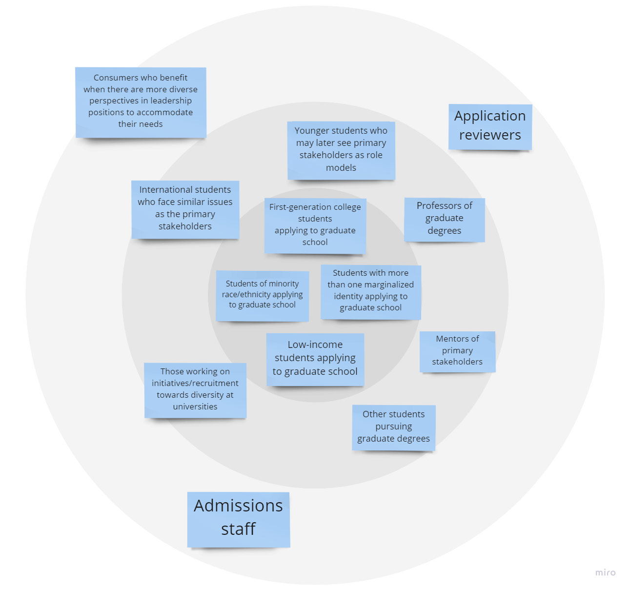
Our Stakeholders

Our Competitive Analysis
SURVEY GOALS
Understand why students apply to graduate school
Understand the barriers that undergraduate students perceive in the graduate school application process
How do these barriers change by identity (low-income group vs first-generation vs underrepresented minority)
Are there any intersectional affects for students who belong to several categories? Is there a relationship between mentorship and graduate school admission?
Does the role, importance, or frequency mentorship change by identity?
Do people pursue research opportunities in preparation for their graduate school application?
How do people find their research opportunities?
What can motivate/demotivate someone to pursue a research opportunity?
Collect contact information for follow-up interviews
INTERVIEW GOALS
Dive deeper into why students choose to pursue graduate school
How do external expectations influence a students’ choice to pursue graduate school?
To understand how students use technology in the graduate school application process
What organizational tools do students use? Are they technological or physical?
What do students like about their organizational tools? What do they think is still missing?
How do students navigate program and university websites in their search for information?
What kind of assistance do students receive in the graduate school application process?
Does guidance from parents/family change if a student is a first-generation college student?
How do mentors assist in the process?
How do/can students that have gone through the process already help?
How do/can faculty at the desired programs/school help?
What make a student hesitant to reach out for support and guidance?
What other external resources do students’ use in their application process?
Diving deeper into graduate school preparation workshops and their usefulness.
Discussions of community and open-source forums as guidance and support.
Hired or paid resources and consultants to revise applications. Who is making use of these kinds of services?
How do student’s belonging in minority racial or ethnic groups, low-income families, and being first-generation college students impact their graduate school application process?
How do each of these identities on their own impact the process?
How does the intersectionality of these identities impact the process?
What are the unique limitations and opportunities of different identities?
We decided to conduct 2 semi-structured interviews with the Graduate Studies Office at Georgia Tech and the Departmental Head of the HCI department. We wanted to learn more about the inner workings of the graduate school admissions process and these faculty members’ perceptions of barriers in the graduate school application process. Additionally, we were interested in the technological applications the office/department utilized during the admission cycle, various diversity and recruitment strategies, availability of funding opportunities in graduate school, and their perception of common methods prospective students used to gather information about the process.


Our Task Analysis
Affinity Mapping
RESEARCH FINDINGS


PERSONAS & EMPATHY MAPS
USER NEEDS
DESIGN PROCESS


WIREFRAMES:
Based on our findings from the sketches, our group decided to incorporate the following features:
Onboarding
Populated list of programs
Search program
Mentor match
Review Repository
Direct messaging
Scheduling a meeting
Timeline & checklist
User Profile


Findings from task-based user testing of wireframes:
Users think the following features are helpful:
Suggested messages
Pop up calendar
Timeline
Users did not want a lengthy verification process
Users wanted to know where they were in the onboarding process
Users were confused by the star rating system
Users were overwhelmed by the checklist and timeline being on the same page
Users wanted to receive notifications from the platform when they are getting close to their application deadline
Users wanted program deadlines to be easily identifiable on the timeline
Users wanted a quick and less time consuming way to look at long reviews
Users were interested in learning more about their mentor
Users want to have more flexibility to filter searched information

PROTOTYPE TESTING


Specific improvements decided by user testing findings:
Sign in with Google and Facebook function added
Shorten verification page
Send users confirmation email after completing verification page
Added progress status dots for onboarding
More specific racial categories for users
Checklist can collapse and expand
Indicator of current time on the timeline
The user can manipulate the timeline to show specific programs
Scheduling meetings function is on a separate page
Add filter to program page
Added search bar/filter* options to mentor
Added heart to favorite program
Changed the presentation of stars on reviews, overall stars are bigger than the review rating stars. (Helps with visual hierarchy)
Buzzwords in reviews
Changed icons to better suit the word they described
Made categories more separate with reviews so it’s visually more clear
Direct message: got rid of action bubbles
Added compatibility to mentor snapshot in dm
Added edit button to the user profile
Include mentor onboarding and verification process
Homepage for mentors
Create a review option for mentors
PROTOTYPE EVALUATION ACTIVITIES:
Expert Evaluation: Cognitive Walkthrough/ Think Aloud
Evaluation Goals: We had several goals for the cognitive walkthrough. We were interested in understanding how users navigated the platform, what users found confusing or unhelpful, and what users valued the most. We wanted to learn more about our users’ experience with the platform so that we could implement better design practices.
DATA ANALYSIS: COGNITIVE WALKTHROUGH
We collected and analyzed the qualitative data from all four expert evaluations for the cognitive walkthroughs. Since we recorded and transcribed the walkthroughs, we assessed our notes from every session and looked for recurring themes or comments. Afterwards, we compiled a list of significant findings based on comments, questions, and user suggestions about the platform.


Expert Evaluation: Heuristic Evaluation
We had several goals for the heuristic evaluation. We were interested in obtaining an expert-level assessment of the degree to which we satisfied the Nielsen Norman design principles. Thus, we asked experts to complete a heuristic evaluation where they would rate our compliance with the Neilsen principles and offer recommendations for our platform. We had 4 participants complete a heuristic evaluation based off of Norman’s Usability Heuristics for User Interface Design. Below is a chart of the ratings by heuristic and by expert, on a scale of 1-5 with 5 being the highest.

Target User Task-Based Testing
Our group conducted in-person, moderated think-aloud user testing with target users to evaluate how well our design fits their mental models. We wanted to examine the usability of each function in our prototype, as well as how users’ behaved and their preferences.
Method Strengths
Provides us with an understanding of how first-time users would interact with the website
Provides us with an understanding of first-time users’ preexisting mental models
Ability for quantitative data analysis in task success/fail rates
Ability to recognize where issues might occur in real-life application
Ability to assess issues in user flow
Ability to observe both behavior and cognition
Method Weaknesses
A limitation of this method was that the Figma prototype is limited to the degree to which it acts as a published website, and so we could not collect data for every interaction
Potential for demand characteristics/biased user feedback (users may often be apologetic for honest feedback or refrain from providing negative feedback)
Lesser evaluation of design principles, thus coupled with a heuristic evaluation
A limitation of this method was that it could not evaluate real-life applications such as when in the application process users may actually use an intervention like ours, which may skew the data as we are only testing users once they are aware of the website and its capabilities. In real life, we may see a greater drop-off in users during the onboarding process.
Procedure:
These user tests consisted of three phases: the think-aloud free-explore phase, the think-aloud task-completion phase, and an open-ended interview phase. 3 task-based tests were conducted in-person and 2 were conducted remotely. During the think-aloud free-explore phase, users were asked to use the prototype as if they had opened this website at home and show us how they would proceed in that scenario while speaking out loud their thought process for certain actions or confusions. The free-explore think-aloud phrase would be approximately 10 minutes long. Throughout the entire user test, if users had questions about where certain information was or what specific buttons did, we asked them questions back in order to prompt further action from them such as “how would you find “Help” if we were not here?”
During the task-completion phase, the interviewer would ask the potential user to carry out tasks on the prototype and again, talk through their thought processes and confusions. During planning, our group decided to prioritize tasks and features that the user had not already encountered during the free-explore phase if we were short on time, but in practice we were able to ask each user every task. The tasks that were asked of participants differed depending on whether they fit the criteria of a potential mentee or a potential mentor. This phase took approximately 20-30 minutes. Responses were measured in quantitative data such as task or success, as well as qualitative data such as documenting cognition.
Finally, during the open-ended interview phase, we asked users about their favorite and least favorite features, as well as other suggestions and concerns. This final phase took approximately 10 minutes. No interview exceeded an hour, with most being completed in approximately 40 minutes.
Data was analyzed through success/fail rates and time taken for tasks for quantitative data and documentation of quotes for qualitative data.
Quotes from Free-Explore Think Aloud:
“I like how the schools are color coordinated”
“Application fee and the deadline is good to know”
“I like how the reviews are divided by categories; in the process, you look at multiple schools for multiple reasons (e.g. affordability); you know where to look if it's divided- I haven’t seen anything like that before”
“How do I navigate ‘Home’?”
“Can I add to the checklist if I wanted to?”
“The onboarding process is clear and simple.
Quotes from Task-Completion Phase:
“I like how there’s a suggested message already available”
“It won’t let me choose two semesters?” (onboarding)“I have some trouble going back to the program page once I click on the message”
“I like the schedule page. It is very clear to see all the meeting appointments.”
“I thought deselecting the checkbox means removing it from the list ”
DESIGN RECOMMENDATIONS FOR FUTURE ITERATIONS + PROTOTYPING


Through this process, I learned:
the value of centering user input,
how important it is to create strong connections with teammates early in the process,
how to analyze qualitative data, while strengthening my skills at analyzing quantitative data,
and that your problem statement will likely change with research and time - and that’s ok!